
Trying to interpret the Treasury Yield Curve can feel a bit like walking into the middle of a conversation where everyone already knows the plot. Yields, maturities, spreads, inversions, recessions. It is easy to nod along and still wonder what the chart is actually telling you. I remember the first time I looked at one seriously. It was just a line with a few dots on a screen, but every headline acted as if that line held the fate of the economy. In a sense, it does matter that much.
Within Economic Analysis, this curve is one of the clearest ways to see how the bond market feels about growth, inflation, and interest rates. A normal upward slope often suggests confidence in the future, while a flat or inverted shape can hint at rising stress or slower growth ahead. For market watchers, business leaders, finance students, and curious readers, learning to read it brings structure to the noise. It helps you separate panic from signal and gives you a calmer, smarter way to understand what the market may be whispering next.
Tools Needed
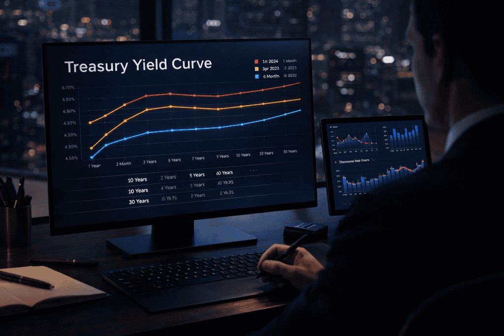
You do not need a Bloomberg terminal or a wall of flashing screens to make sense of the Treasury Yield Curve. What you really need is a current yield chart, a basic understanding of Treasury maturities, and a habit of asking simple questions. Which yields are higher, short-term or long-term? Is the line rising, flattening, or bending backward? It also helps to keep a notebook or spreadsheet for tracking the spread between the 2-year and 10-year yields, since that comparison is often watched closely by investors.
A good financial news source adds context, but the real skill is interpretation, not information overload. Think of it like reading the sky before a storm. You do not need to be a meteorologist to notice the clouds changing shape.
| Tool or Material | Why You Need It |
|---|---|
| Treasury yield chart | Shows rates across maturities in one visual line |
| Basic bond vocabulary | Helps you understand terms like yield, maturity, and spread |
| Notebook or spreadsheet | Useful for tracking changes over time |
| Reliable finance website | Adds background and market context |
| Calm mindset | Keeps you from overreacting to one dramatic move |
Treasury Yield Curve Instructions
Step 1: Identify the Shape of the Curve
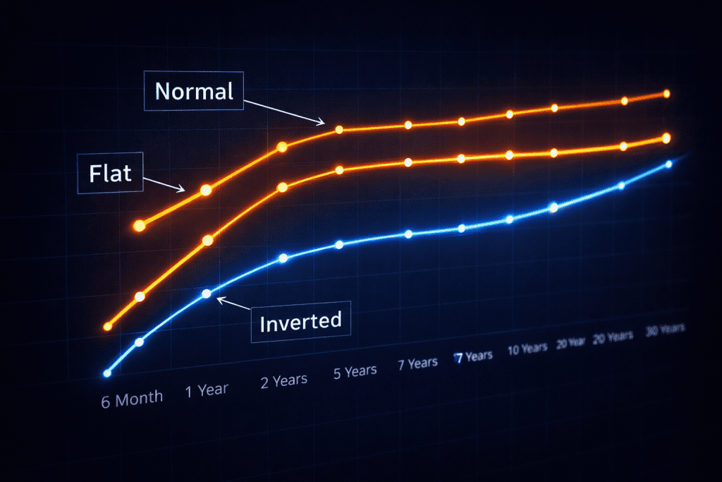
Start by looking at the line itself, not the headlines around it. The first job is to notice the shape. If short-term yields are lower and long-term yields are higher, the curve is normal. If the line is mostly flat, expectations may be shifting. If short-term yields rise above long-term yields, the curve is inverted. That last shape gets attention because it has often appeared before recessions, though it is not a magic crystal ball. The curve is a signal, not a prophecy.
Step 2: Compare Key Treasury Maturities
Next, compare specific maturities rather than staring at the full chart and hoping insight will strike. The most discussed spread is usually the gap between the 2-year and 10-year Treasury yields. Some analysts also watch the 3-month and 10-year spread. If the gap narrows, confidence may be cooling. If it turns negative, markets may be expecting weaker growth and lower future rates. This is where interpretation becomes more useful than memorization. You are not just reading numbers. You are reading expectations.
Step 3: Connect the Curve to the Broader Economy
Now add economic context. Ask what the Federal Reserve is doing, what inflation looks like, and whether investors seem nervous about future growth. Short-term yields are often influenced by current policy rates, while longer-term yields reflect expectations about inflation and economic conditions over time. That is why the curve can flatten or invert when markets believe rate cuts may come later. A line on a chart suddenly makes more sense when you connect it to real economic pressure, not just market chatter.
Step 4: Use the Curve as One Part of Your Analysis
Finally, use the Treasury Yield Curve as one lens, not the whole camera. Pair it with employment data, inflation trends, consumer spending, and credit conditions. One of the biggest mistakes beginners make is treating the curve like a giant red alarm button. It is better used as part of a wider checklist. Think of it as a seasoned friend who lowers their voice at the exact moment everyone else in the room gets louder. You pay attention, but you still look around before making a decision. That is also why it should inform a generic investment plan rather than replace disciplined thinking.
Treasury Yield Curve Tips and Warnings

Reading the Treasury Yield Curve well takes patience because the biggest danger is oversimplifying it. An inverted curve has often been treated as a warning sign for recession, but timing matters, and markets do not move on a neat classroom schedule. Sometimes the signal appears well before the slowdown everyone fears. Sometimes other shocks arrive and muddy the picture.
I once watched a room full of people react to an inversion as if a market crash had already landed before lunch. That kind of panic is exactly what you want to avoid. The curve is better at hinting that conditions may weaken than telling you what tomorrow morning will bring. In practical Economic Analysis, context is everything. Use the curve to frame questions, not to end them.
Another smart habit is to resist forcing the curve into whatever story you already want to believe. If you are hunting for the Best stocks to buy, building trading strategies, or trying to understand the wider Economic System, the curve can help, but it should not be the only voice in the room. Watch trends over time instead of reacting to a single day. Compare the move with inflation data and policy expectations. Be careful with dramatic commentary that treats every flattening as disaster or every steepening as celebration. The best interpreters are usually the calmest ones. They notice the shape, check the spread, connect it to broader conditions, and then step back before jumping to a conclusion.
| Tip or Warning | Why It Matters |
|---|---|
| Watch the shape over time | One-day moves can be noisy |
| Focus on key spreads | The 2-year/10-year and 3-month/10-year often carry useful signals |
| Do not treat inversion as instant recession | The curve warns, but timing varies |
| Add policy and inflation context | Rates do not move in isolation |
| Avoid emotional reactions | Panic usually leads to poor interpretation |
Conclusion
Once you stop seeing it as a mysterious finance diagram, the Treasury Yield Curve becomes much easier to read. Start with the shape. Check the key spreads. Add context from inflation, growth, and Federal Reserve policy. Then step back and use the curve as part of a broader view rather than a standalone verdict. That is really the heart of solid interpretation. You are not trying to predict every twist in the market. You are trying to understand what investors, collectively, may be expecting about the road ahead.
In Economic Analysis, that is powerful. It gives structure to uncertainty and helps you respond with more clarity and less guesswork. So the next time you see the chart in an article or on a market dashboard, do not scroll past it. Pause, read the line, and let it tell its story.
FAQ
What does Treasury Yield Curve interpretation mean in Economic Analysis for beginners?
In simple terms, it means reading the pattern of Treasury yields across short and long maturities to understand what the bond market may be signaling about growth, inflation, and future interest rates. For beginners, the easiest place to start is by asking whether the line slopes upward, sits flat, or turns upside down. That quick visual check already tells you a surprising amount.
Why does the Treasury Yield Curve sometimes invert in Economic Analysis?
An inversion usually happens when short-term yields move above long-term yields. That can reflect tight monetary policy, expectations of slower growth, or belief that rates may fall in the future. In plain English, the bond market may be saying, “Things look harder ahead than they do right now.” That is why inversions attract so much attention from economists and investors.
How do professionals use the Treasury Yield Curve for recession signals in Economic Analysis?
Professionals usually do not rely on the curve alone. They compare major spreads, study central bank policy, track inflation and labor data, and then place the signal inside a larger economic picture. The curve is valuable because it captures market expectations, but its real power comes from being used alongside other indicators rather than in isolation.
Resources
- Investopedia. What an Inverted Yield Curve Tells Investors
- Investopedia. Yield Curve: What It Is, How It Works, and Types
- Britannica Money. Yield Curve Basics: How to Read the Bond Market
- Charles Schwab. What Is the Treasury Yield Curve?
- The Motley Fool. Treasury Yield: What It Is and How It Works