
In the ever-evolving world of technology trends, data is the heartbeat of every digital enterprise. Organizations today collect vast amounts of metrics from applications, servers, and networks — but the challenge lies in understanding what that data means. This is where visualization platforms like Grafana play a pivotal role.
This open-source analytics solution transforms raw numbers into meaningful, interactive dashboards. It gives developers, engineers, and business leaders the power to see real-time performance, identify patterns, and make informed decisions with clarity and precision.
Imagine having a command center that visually tells you how your entire infrastructure is performing — from cloud servers to IoT sensors — all in one place. That’s the strength of this modern monitoring platform.
By integrating seamlessly with databases and observability tools, it bridges the gap between data collection and actionable insights, making it indispensable in DevOps, IT operations, and business intelligence workflows.
What is Grafana?
At its core, Grafana is an open-source visualization and analytics tool designed to monitor metrics and logs from multiple data sources in one unified interface.
It enables users to create dynamic, interactive dashboards that display real-time performance data. By connecting to systems like Prometheus, InfluxDB, Elasticsearch, and AWS CloudWatch, it provides a holistic view of infrastructure health, application performance, and business KPIs.
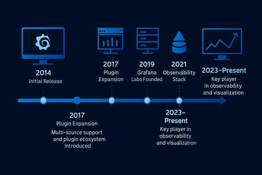
Developed by Torkel Ödegaard in 2014, this solution has since become the go-to tool for observability and performance monitoring across industries. Its flexibility and extensibility make it suitable for developers, data analysts, and IT administrators alike.
With support for plugins, alerts, and customizable panels, it allows users to turn data into visual stories — making complex systems understandable at a glance.
Breaking Down Grafana
This visualization suite is built on a modular, scalable architecture that makes it adaptable to any data environment.
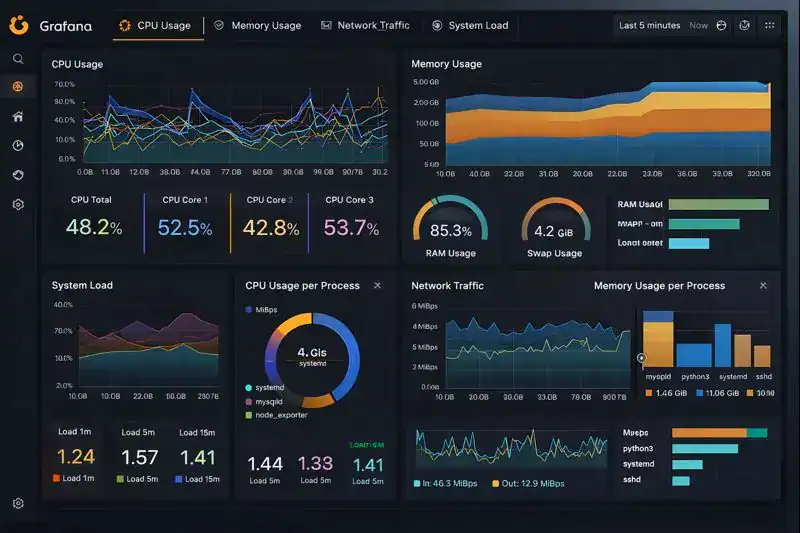
The foundation lies in dashboards, which act as customizable canvases for visualizing data. Each dashboard consists of panels, which represent metrics through charts, graphs, gauges, or heatmaps. Users can arrange these panels to suit specific workflows — from monitoring CPU usage to tracking API latency.
Next are data sources, which serve as the connectors to underlying databases or monitoring tools. The platform supports a wide range of integrations, from SQL and NoSQL databases to time-series systems like Prometheus or Graphite.
Alerting and notifications are also integral. Users can configure thresholds, receive alerts via Slack or email, and automate responses when certain metrics cross defined limits.
Finally, user management and access control ensure that teams collaborate safely, with customizable permissions and role-based security.
All of these components combine to create a unified observability experience — one where teams can see, understand, and act on data instantly.
History of Grafana
The platform began as a fork of Kibana in 2014, focusing specifically on graphing and visualization for time-series data. Its creator, Torkel Ödegaard, envisioned a more flexible, open-source tool that could connect to multiple data sources without vendor lock-in.
As cloud computing and DevOps practices gained traction, adoption skyrocketed. By 2019, the company behind it, Grafana Labs, had expanded its ecosystem with products like Loki (for logs) and Tempo (for traces), transforming the tool into a full observability stack.
| Year | Milestone | Description |
|---|---|---|
| 2014 | Initial Release | Introduced as an open-source visualization tool for time-series data. |
| 2016 | Plugin System | Added extensibility through custom plugins and panels. |
| 2018 | Enterprise Edition | Launched with advanced security and scalability features. |
| 2020 | Cloud Service | Introduced hosted solution for global accessibility. |
| 2023–Present | Unified Observability | Expanded integration with metrics, logs, and tracing ecosystems. |
From its humble beginnings to becoming a global standard for monitoring and visualization, this tool has reshaped how organizations interact with their data.
Types of Grafana
This visualization and monitoring solution comes in multiple versions, designed for different scales and use cases.
Open Source Edition
The community-driven version is completely free and ideal for developers, startups, and small teams. It offers all core visualization and alerting features, allowing users to create powerful dashboards from any data source.
Enterprise Edition
This premium version provides advanced capabilities such as granular access control, team permissions, and enhanced security. It also includes 24/7 support from Grafana Labs, making it suitable for large-scale organizations that require compliance and stability.
Cloud Edition
Hosted by Grafana Labs, this version eliminates infrastructure management entirely. It provides instant scalability, automated updates, and integration with Grafana Cloud’s full observability stack — including metrics, logs, and tracing.
On-Premises Deployment
For companies with strict data governance or regulatory requirements, on-premises deployment offers full control over infrastructure and data storage. It provides the same functionality while maintaining internal data sovereignty.
Custom Plugins and Integrations
Users can extend functionality through custom plugins, adding new visualization types or connecting to third-party APIs. This flexibility allows organizations to tailor dashboards precisely to their monitoring needs.
How It Works
The system operates by connecting to data sources, retrieving time-series data, and displaying it in user-defined visual formats.
Once connected, users can build dashboards by selecting panels and metrics they wish to display. The interface allows real-time queries, transformations, and filters to refine data views. These dashboards update continuously, reflecting live system performance and user-defined thresholds.
When alerts are configured, the platform continuously evaluates metrics in the background. If anomalies or threshold breaches are detected, it sends notifications through channels like Slack, PagerDuty, or email.
The architecture relies on an API-driven design, allowing developers to automate configuration, provisioning, and data collection at scale. Whether deployed in the cloud or on-premises, it ensures fast, responsive access to real-time analytics across distributed systems.
This simplicity — paired with powerful visualization — makes the platform an essential component in modern observability workflows.
Pros & Cons
| Pros | Cons |
|---|---|
| Real-time visualization and interactive dashboards | Requires initial setup and configuration |
| Supports numerous data sources and integrations | Advanced features locked in paid versions |
| Strong open-source community and plugin ecosystem | Can consume significant resources at scale |
| Flexible alerting and automation | Steeper learning curve for beginners |
| Ideal for DevOps, IoT, and business analytics | Complex dashboards may impact performance |
Its advantages far outweigh its limitations. Once properly configured, it delivers unparalleled insight, scalability, and flexibility for teams managing complex infrastructures.
Uses of Grafana
In DevOps Monitoring
DevOps teams rely on this platform to monitor system health, latency, and application uptime. By integrating with Prometheus or Kubernetes, engineers can visualize server performance and respond quickly to issues.
Example: A cloud provider tracks CPU usage and network latency across multiple regions to ensure high availability.
In Business Analytics
Companies use dashboards to visualize sales data, conversion metrics, and customer engagement trends. Its integration with SQL databases makes it a go-to solution for non-technical analysts as well.
Example: A retail brand monitors regional sales performance through live dashboards that update every few seconds.
In IoT and Edge Computing
IoT systems generate massive data streams from connected devices. This tool helps engineers monitor sensors, predict failures, and optimize efficiency.
Example: A logistics company visualizes vehicle telemetry data to improve route optimization.
In Security Operations
Security teams use the platform to track login attempts, anomalies, and network threats in real time. Visual alerts help detect and mitigate incidents faster.
Example: A financial firm monitors unusual API traffic to detect potential cyberattacks.
In Education and Research
Researchers and educators use it to analyze datasets interactively, visualize results, and demonstrate trends in real time.
Example: A university displays live environmental data from IoT sensors across campus.
Through these diverse applications, the platform proves its adaptability across industries — turning data into decisions, and complexity into clarity.
Resources
- Grafana Labs: Official Documentation
- Red Hat: Understanding Observability Platforms
- TechTarget: Data Visualization in DevOps
- IBM Developer: Building Dashboards with Grafana
- DigitalOcean: Introduction to Monitoring and Metrics Visualization