

When I first started digging into housing numbers, I made the same mistake a lot of people make: I looked at headlines, nodded like I understood the market, and moved on. Then I opened Redfin Data Center, and suddenly the story got more interesting. Instead of broad claims, I could see supply shifts, price changes, days on market, and investor activity in a way that felt concrete and surprisingly readable. That matters in Economic Analysis, where one chart can challenge a dozen lazy assumptions. Redfin says its downloadable housing market hub includes home prices, sales, inventory, new listings, and other local-level measures, with weekly data updated each Wednesday and monthly releases on the third full Friday of the month.
Tools Needed
To use Redfin Data Center well, you do not need a finance degree, a giant software budget, or some secret analyst badge. You need a laptop, a stable internet connection, a spreadsheet tool like Excel or Google Sheets, and a clear question. That last one matters most. Are you tracking cooling demand, comparing metros, or watching investor-heavy zip codes?
Redfin’s official data center lets users visualize and download housing market data across metros, cities, neighborhoods, and zip codes, while the metrics definitions page explains what terms like price drops and rolling windows actually mean. If you want to go deeper, a Python workflow or BI tool can help, but it is not required. Think of it like cooking: a good pan helps, but the recipe still comes first.
| Item | Why You Need It |
|---|---|
| Computer or tablet | To browse charts and download files |
| Internet connection | To access live charts and datasets |
| Spreadsheet software | To sort, filter, and compare data |
| Research question | To keep analysis focused |
| Notes document | To record patterns and conclusions |
Redfin Data Center Instructions
Step 1: Define Your Housing Market Question Clearly
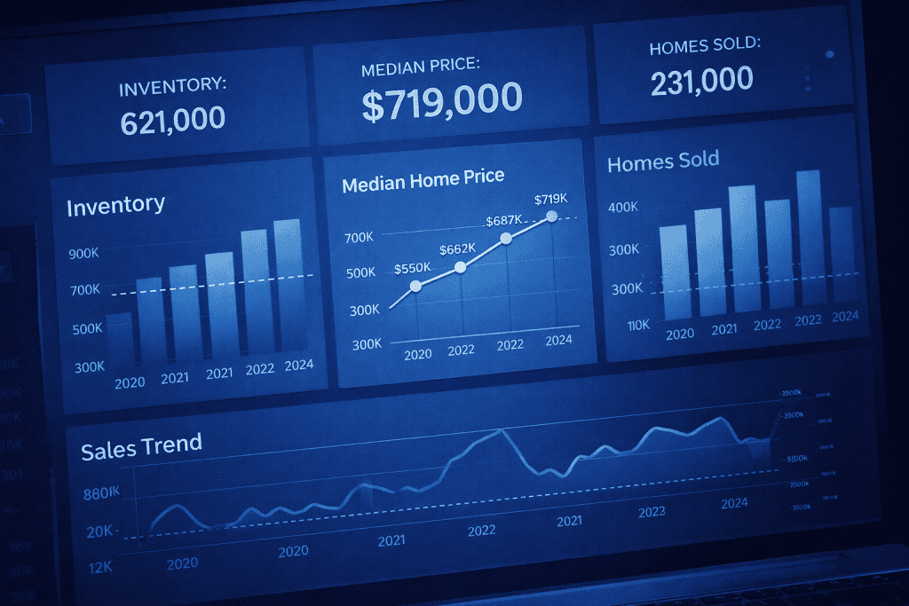
Start with one focused question before opening Redfin Data Center. This sounds simple, but it saves you from drowning in tabs and colorful charts. Ask something like, “Are homes in my target metro taking longer to sell?” or “Is investor activity rising where prices are softening?” A narrow question turns a giant data library into a practical tool. Redfin’s hub includes weekly housing market data, monthly housing market data, investor data, rental data, and buyer-versus-seller dynamics, so your question should guide where you begin.
Step 2: Choose the Right Region and Time Frame
Open the weekly or monthly section inside Redfin Data Center and choose a geography that actually fits your goal. Weekly data is useful when you want fresher trend signals, while monthly data helps you see the bigger arc without as much short-term noise. Redfin notes that its weekly figures are computed daily as rolling one-, four-, or twelve-week windows and grouped locally by metro area and county, which means they are timely but should be read with care. I usually compare at least two nearby markets because one city by itself can fool you.
Step 3: Compare Key Metrics for Better Insight
Once you have a region selected, use Redfin Data Center to compare a few core metrics together instead of staring at just one. New listings, homes sold, median sale price, days on market, and price drops tell a fuller story when viewed side by side. The Encore Bubble overview highlights that Redfin’s weekly and monthly tools surface measures such as new listings, pending sales, active listings, median days on market, price drops, and months of supply. In real life, markets rarely move in neat lines. Prices may stay sticky even when demand is already softening underneath.
Step 4: Download and Organize the Data
Download the dataset from Redfin Data Center and clean it in a spreadsheet or analytics tool. This is where the fun starts. Sort by date, calculate year-over-year changes, and flag unusual jumps. A recent engineering walkthrough on DEV describes using Redfin-sourced housing data in an end-to-end pipeline that moves from extraction and transformation into storage and visualization, which shows how useful the data can be once structured properly. You do not need that full setup to get value. Even a simple chart can reveal when emotion in the market is outrunning evidence.
Step 5: Turn the Data Into Economic Insight
Use Redfin Data Center findings to build an argument, not just a chart. Maybe inventory is climbing while sale-to-list ratios are slipping. Maybe investor-heavy areas are more fragile than owner-occupied ones. Maybe a local slowdown is not a collapse, just a normalization after a chaotic run-up. This is where Economic Analysis gets practical. You are not collecting trivia. You are asking what the numbers suggest about behavior, affordability, and momentum inside a broader Economic System. Done well, this process can sharpen a housing memo, a neighborhood report, or even a cautious investment plan.
Redfin Data Center Tips and Warnings

The biggest strength of Redfin Data Center is also the biggest trap: it gives you so much information that it is easy to sound smarter than you really are. I learned that the hard way after confidently telling a friend his local market was “obviously crashing” because price drops were rising. A week later, I realized listings were seasonal, demand had softened only slightly, and I had ignored sales pace altogether.
That was a humbling reminder. Redfin explains that much of its housing data comes from local MLS feeds, with some metrics supported by public records, and its national methodology is designed to improve representativeness while still carrying coverage limits. So treat the tool as a guide, not a crystal ball. Use Redfin Data Center with context. A spike in inventory may signal cooling demand, or it may reflect sellers returning in spring. A drop in median price may hint at weakness, or it may simply mean smaller homes sold that month. Investor-share maps can be useful, especially because Redfin’s data center includes investor market share views by metro and zip, but they should never be read in isolation.
This is also where people start chasing dramatic phrases like market crash, Best stocks to buy, or flashy trading strategies when the data really calls for patience and comparison. Housing analysis rewards discipline more than drama.
| Tip or Warning | Why It Matters |
|---|---|
| Compare multiple metrics | One metric alone can mislead |
| Check definitions first | Rolling averages and price-drop logic affect interpretation |
| Use local comparisons | Neighboring metros often reveal whether a pattern is unique |
| Watch seasonality | Housing data often swings with the calendar |
| Avoid headline bias | News stories can exaggerate what the data actually shows |
Conclusion
Using Redfin Data Center does not require you to become a full-time economist. It just asks you to slow down, ask better questions, and let the data speak before your opinions do. Start with a clear goal, choose the right time frame, compare more than one metric, and download the numbers when you need a closer look. That simple routine can turn vague market chatter into grounded Economic Analysis.
Redfin launched the data center to let users visualize and download real estate market data such as prices, sales, and listings, and over time it has expanded the ways people can examine demand and local market behavior. If you have ever wanted to understand housing without getting lost in jargon, this is a solid place to begin. Open the charts, follow the patterns, and trust careful reading over loud predictions.
FAQ
How can Redfin Data Center help with local housing market economic analysis?
Redfin Data Center helps with local Economic Analysis by giving you direct access to metrics like inventory, median sale prices, days on market, and price drops across metros, counties, cities, neighborhoods, and zip codes. That lets you compare local momentum against broader trends instead of relying on national headlines. Redfin also publishes metric definitions and downloadable files, which makes it easier to verify what each chart actually measures.
Is Redfin Data Center good for long-term economic analysis of real estate trends?
Yes. Redfin Data Center is useful for long-term Economic Analysis because its monthly housing market data reaches back for many years, while weekly data helps spot shorter-term shifts sooner. The strongest approach is to pair long-range monthly trend reading with weekly signals, then test whether those changes hold across nearby markets instead of assuming one move tells the whole story.
What is the best way to use Redfin Data Center for downloadable housing market data and investor trend research?
The best method is to open Redfin Data Center, choose the market type and region you care about, review the definitions, then export the dataset for your own comparisons. If your goal is deeper Economic Analysis, combine price, supply, and investor-share views rather than focusing on a single flashy metric. Redfin’s official hub specifically includes investor data and downloadable regional files, which makes this workflow practical even for solo researchers.
Resources
- Encore Bubble. Data Sources – Redfin Data Center
- DEV Community. ETL Real Estate Data Engineering with Redfin: From Extraction to Visualization
- Crawl Feeds. Redfin Properties Dataset
- Redfin. Why Redfin?
- Business Model Canvas Template. What Is Brief History of Redfin Company?