
If you’ve ever wondered Tailwind and why it’s all over the web development community, you’re in the right place. In the fast-evolving world of technology trends, developers constantly search for tools that make their work faster, cleaner, and more efficient. It has become one of the most talked-about frameworks because it completely changes how we think about styling websites. Instead of writing endless lines of CSS, Tailwind gives developers a smarter way to build — through utility classes that do the heavy lifting.
I still remember the first time I used Tailwind. I was building a personal portfolio site, and instead of juggling dozens of CSS files, I wrote my layout directly in my HTML. The moment I refreshed the page, it just worked. The colors, spacing, and typography all came together seamlessly. That’s when I truly understood what is Tailwind — not just a framework, but a way of thinking differently about design and development.
What Is Tailwind?
At its core, it refers to Tailwind CSS, a utility-first CSS framework that helps developers build modern interfaces faster. Instead of starting from scratch with custom CSS, Tailwind provides pre-designed classes for almost everything — margins, padding, colors, typography, and responsiveness.
Think of it as having a huge box of design Lego blocks. Each class is a piece, and you can combine them to create anything you want — from sleek dashboards to minimalist landing pages. It’s flexible, scalable, and perfect for teams who want to maintain consistent styles without rigid templates.
Other frameworks, like Bootstrap, come with predefined components. Tailwind, however, gives you freedom — complete control over every pixel while still keeping your code organized and efficient.
Breaking Down Tailwind
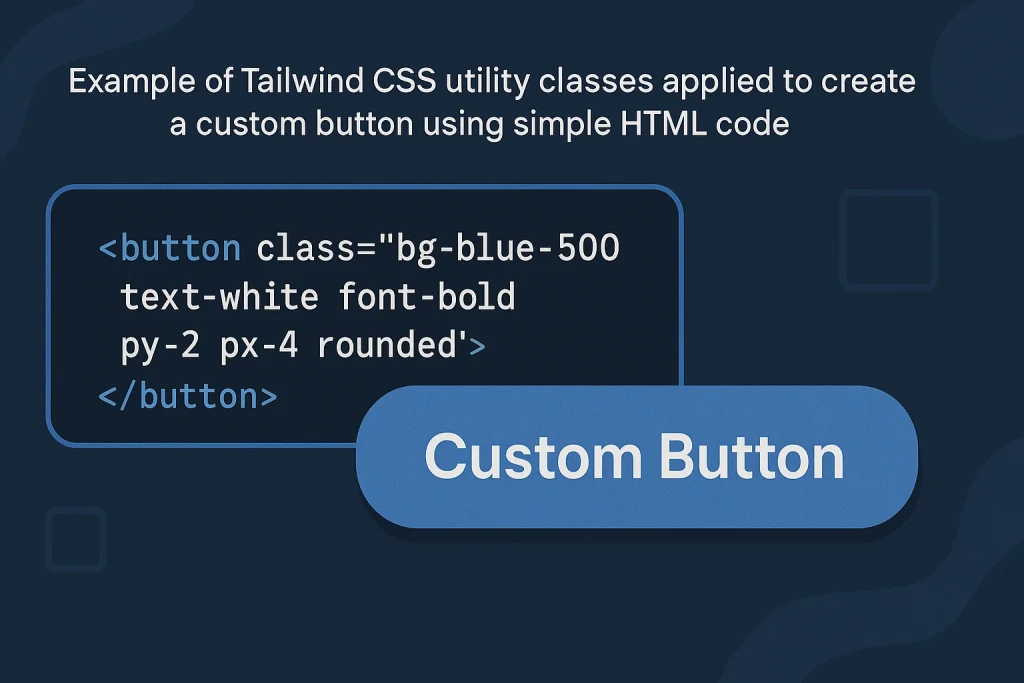
Let’s break down Tailwind to understand how it actually works. It is built around utility classes, which are small, single-purpose CSS rules. For example:
p-4adds padding.text-centercenters text.bg-blue-500sets the background color.
By combining these, you can style an entire web page without writing custom CSS. It also includes responsive and hover variants, allowing you to adapt designs across devices.
Here’s a quick example:
With just one line, you’ve got a perfectly styled, responsive button. That’s the beauty of this framework— it’s fast, clean, and easy to customize.
It is also deeply integrated with build tools like PostCSS and can be configured through its tailwind.config.js file. This means developers can define custom colors, spacing, and themes for their projects, ensuring brand consistency and scalability.
History of Tailwind
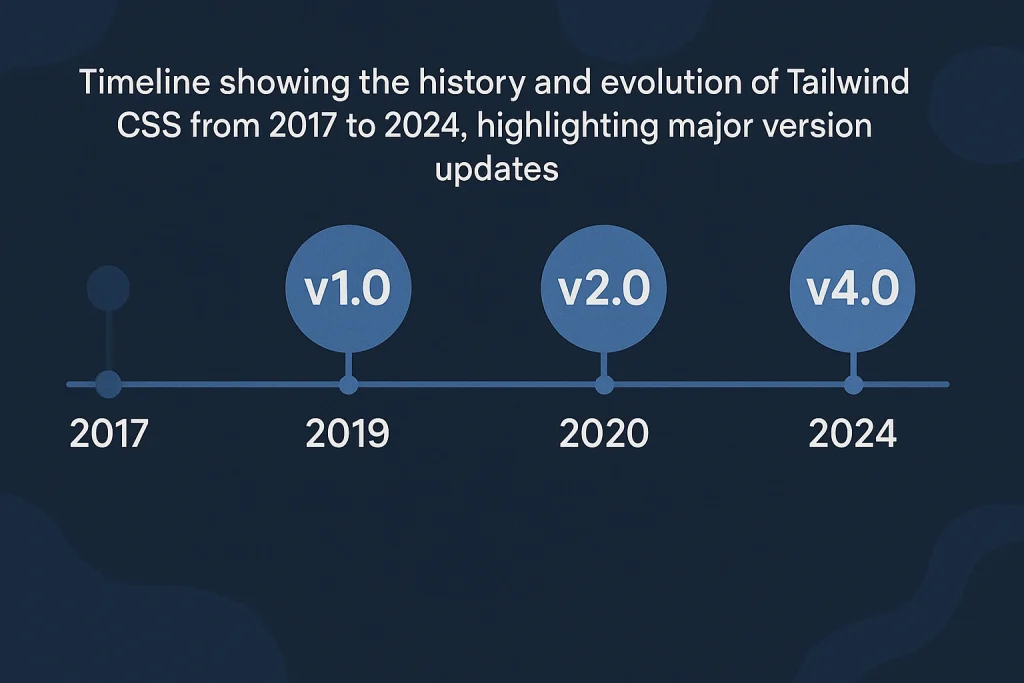
It was created by Adam Wathan in 2017. He wanted a better way to build interfaces — one that didn’t rely on rigid design systems or repetitive CSS rules. His goal was to give developers complete control without sacrificing productivity.
Since its release, it has gained massive popularity, becoming a go-to framework for developers worldwide. It’s open-source, community-driven, and continually evolving.
| Year | Milestone | Description |
|---|---|---|
| 2017 | Launch | Tailwind CSS is released by Adam Wathan. |
| 2018 | Adoption | Developers begin embracing its utility-first approach. |
| 2020 | Tailwind v2 | Introduces dark mode and improved customization. |
| 2022 | Tailwind v3 | Adds JIT (Just-In-Time) engine for faster builds. |
| 2024 | Continued Growth | Dominates frontend frameworks for design flexibility. |
Its journey mirrors the growth of Innovation in web development — where efficiency meets creativity.
Types of Tailwind
While the word Tailwind usually refers to Tailwind CSS, the framework has expanded into different tools and ecosystems.
Tailwind CSS
This is the core product — a utility-first CSS framework that simplifies styling. It’s widely used across startups, agencies, and enterprises for building scalable UI systems.
Tailwind UI
The UI offers pre-built, beautifully designed components that speed up design processes. It’s perfect for developers who want to create polished interfaces without starting from scratch.
Tailwind Labs Tools
Tailwind Labs, the company behind the framework, also maintains tools like Headless UI (for accessible components) and Heroicons (a free icon library). These tools extend the framework ecosystem, making web development even more seamless.
How Does Tailwind Work?
It works by using utility classes that apply specific styles directly in your markup. The process follows these steps:
- Setup: Install the framework using npm or yarn.
- Configuration: Customize your settings in
tailwind.config.jsto define your color palette, font sizes, and more. - Build: Use the framework’s JIT compiler to generate only the CSS you use, keeping files lightweight.
- Development: Apply utility classes in your HTML to design components quickly.
- Optimization: The framework automatically removes unused CSS in production builds.
This workflow creates a clean, fast, and maintainable environment that supports futuristic technology trends like responsive design and accessibility.
Pros & Cons
Every tool has its strengths and weaknesses, and understanding them helps developers make smarter decisions. This framework has revolutionized how web interfaces are built, yet it’s not perfect for every scenario. What makes it powerful is its ability to merge creativity and control — but like any advanced approach, it comes with a learning curve.
On the bright side, developers appreciate how fast it accelerates the design process. Instead of switching between HTML and CSS files, you can focus on crafting layouts directly in your markup. It’s flexible, consistent, and easy to scale for both small and enterprise-level projects. With the built-in Just-In-Time (JIT) engine, the workflow feels almost futuristic — compiling only what’s needed and keeping websites light and efficient.
However, the same speed and flexibility that make it so appealing can also lead to cluttered code if not managed carefully. For beginners, reading long strings of utility classes can seem overwhelming at first. Some designers also miss the traditional separation between structure and style, feeling like everything blends together too much. Additionally, setting up the environment requires basic knowledge of build tools, which might be intimidating for those coming from simpler CSS setups.
That said, once developers push past the initial learning phase, the system proves its worth. It streamlines collaboration, encourages reusable design patterns, and integrates smoothly with modern technologies. The key lies in balance — learning when to rely on utilities and when to create custom components for cleaner, more maintainable projects.
| Pros | Cons |
|---|---|
| Fast development with reusable utilities | Initial learning curve |
| Highly customizable | HTML can look cluttered |
| Small final CSS size with JIT | Requires build setup |
| Strong community support | Not ideal for minimal CSS-only projects |
Overall, the pros outweigh the cons, especially for developers seeking scalability and efficiency.
Uses of Tailwind
It is versatile and used across industries, from startups to enterprise solutions. It simplifies design workflows, enhances collaboration, and ensures consistency across products.
Web Development
Developers use this library to design modern websites and apps with minimal effort. It allows for quick prototyping and easy adjustments without touching CSS files.
UI/UX Design
Designers love it because it maintains consistency and visual harmony. It lets them focus on user experience rather than repetitive styling.
E-commerce Platforms
Many e-commerce developers rely on it to create visually appealing, responsive interfaces that boost engagement and conversion rates.
Corporate Dashboards
For data-driven companies, it provides a clean structure for dashboards and admin panels. Its utility classes make it easy to handle layout complexities and responsiveness.
Mobile-Responsive Apps
Thanks to its responsive design features, it simplifies building mobile-friendly applications that adapt seamlessly to all devices — a hallmark of advanced technology.
Resources
- Tailwind CSS Official Site. Learn the basics and explore its features.
- Tailwind UI. Explore professional-grade UI components.
- Heroicons. Free icons built for Tailwind.
- Headless UI. Accessible UI components for React and Vue.
- Tailwind Toolbox. A collection of open-source Tailwind templates.